
Chatbooks Onboarding
Guiding users while showcasing Chatbooks’ unique value
THE TEAM
Q2 2025 - Q3 2025 Ashley Lindsey: PM, UXR Sydney Robertson (me): UI/UX, AnimationYon Montoto: IOS DevDaniel George: Android Dev 1. INTRODUCTION
About the client: Chatbooks creates printed photo books directly from your phone’s camera roll, offering both one-time purchases and a unique subscription service.
The state of things: Chatbook’s conversion rates were slipping: new users were taking longer to create their first book, fewer explored product pages after launch, and many never made it to purchase. Our onboarding experience—generic and impersonal—wasn’t helping.
2. PROBLEM
Onboarding left them overwhelmed by options and unclear about what made Chatbooks unique.
Emotional connection was minimal during this critical first-time experience, and our differentiators often went unnoticed until after a purchase was made (if at all).
The state of onboarding:
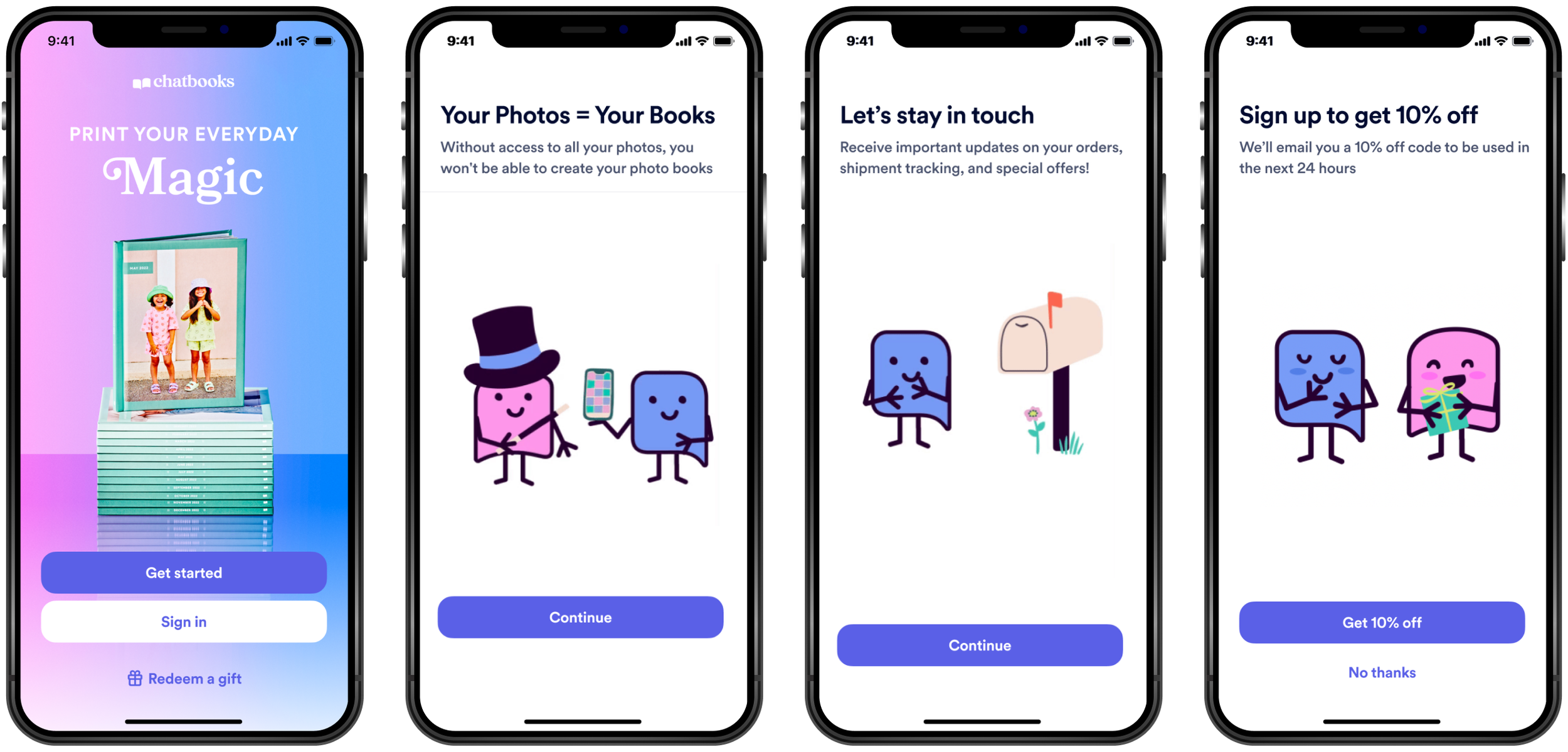
Permission-heavy start: Users face a sequence of screens requesting photo, notification, and tracking access, followed by a 10% off offer.
No mission or purpose: Chatbooks’ value and vision are not introduced upfront.
Premature requests: Access feels rushed, eroding trust and prompting questions about why permissions are needed.
Unclear product fit: Users must figure out on their own which product best meets their needs.

Create a personalized onboarding that showcases Chatbooks’ unique value and guides the user to the right product
3. THE PROPOSED SOLUTION
Personalize the journey using user inputs (goals, preferences, needs).
Highlight use cases first, then map them to product lines for clarity.
Showcase key differentiators—honest pricing, toddler insurance, ease of use, exceptional service, and a happiness guarantee—to stand out from competitors.
Deliver tailored reminders (via Push/SMS) to clarify the value of permissions, keep users engaged, and help them complete their first book.
4. RESEARCH
How can we tell Chatbooks’ story while also guiding users to the right product?
Previous findings confirmed the need for this project. The key question that remained was:
To explore this, I conducted a competitive analysis focused on onboarding flows—especially from companies offering subscription-based products. Brands audited included Hims, Billie, Matter, Temply, Lapse, Duolingo, and others.
Methodology

Matter’s onboarding subtly led users to see regular reading as essential, positioning the app as a necessary tool.

The Hims skin quiz earned my trust—the number and quality of questions felt sufficient to support a credible recommendation.
Effective onboardings clearly demonstrated how the product solved a user problem.
Key insights
Personalized quizzes created a sense of connection and helped guide users toward the right product fit.

5. DESIGN PROCESS
I iterated through multiple versions, testing different ways to balance storytelling, product education, and user guidance.
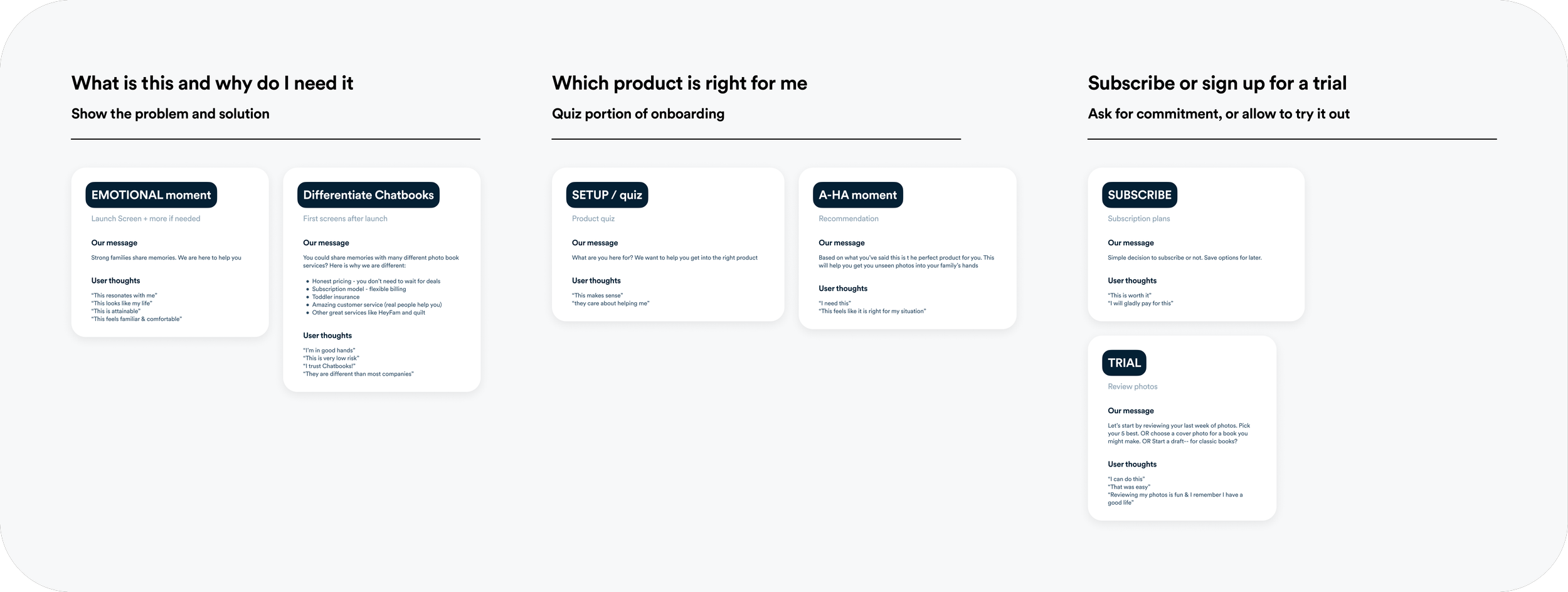
I began by mapping out a general onboarding flow designed to hit key moments: an emotional realization of how many photos users have and their need to organize them, a clear point of differentiation showing what makes Chatbooks unique, and finally, a moment of commitment where users choose a product or start a trial.
VERSION 1
What worked:
Guided the user towards a product recommendation.
Highlighted differentiation and Chatbook’s mission
What didn’t
Asked for photo permission too early, before users understood why
Quiz questions felt bit shallow, leading to weak or generic recommendations
Felt too long and overloaded
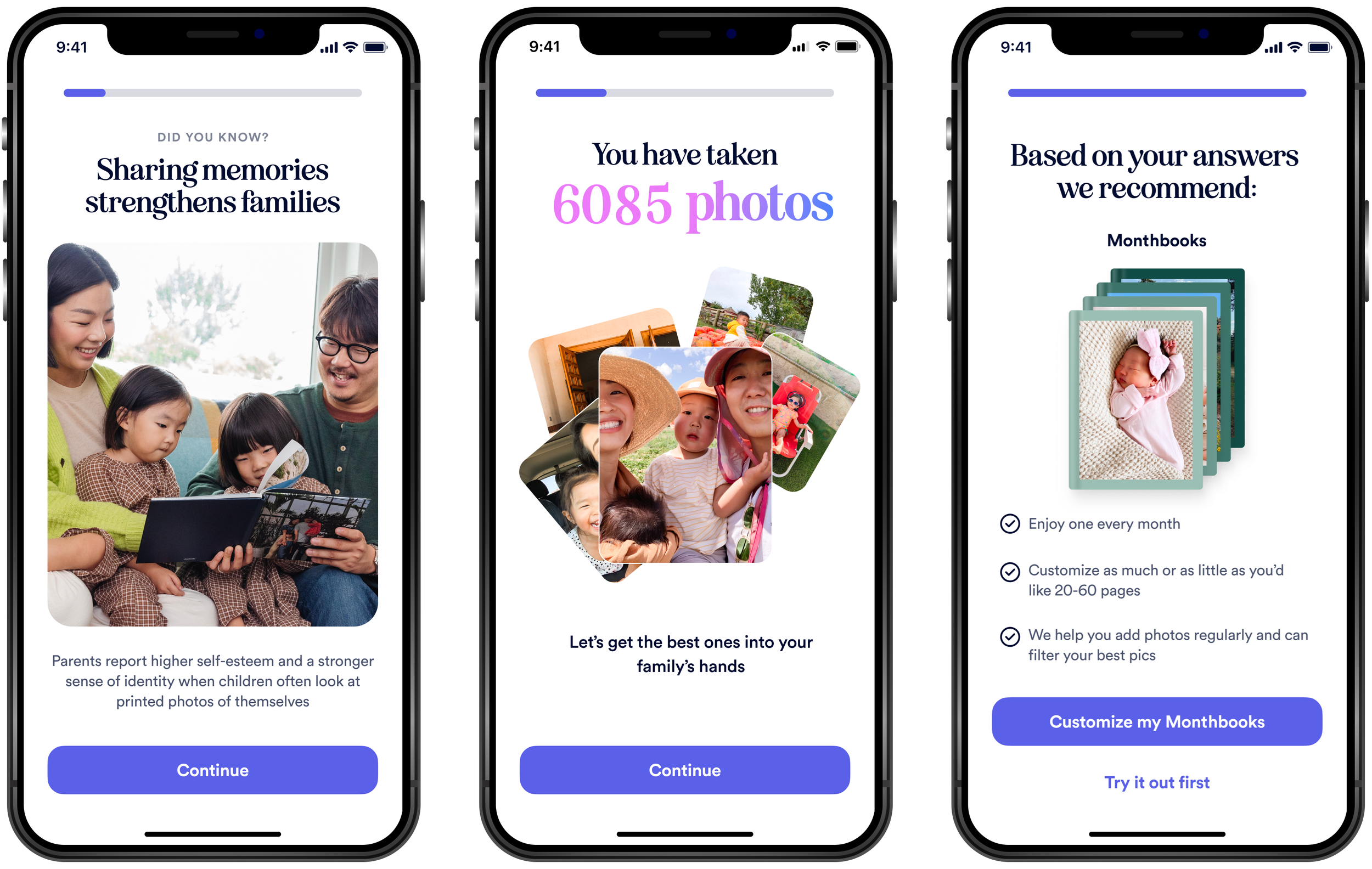
VERSION 2

I iterated on version 1 with 2 new directions based on the same idea
1. A traditional product quiz
2. A chat-style quiz with ““Chatty“ our mascot
The chat-style idea would have taken considerable time to prototype in Figma due to the many possible quiz paths. To save time and still test the concept, I built an interactive prototype in V0, which allowed users to input real responses and receive genuine recommendations.
The link to that protoype is here
What worked:
Both formats performed well with users (no clear winner).
High-fidelity prototypes gave realistic insights without consuming developer resources.
I moved Permission screens to contextual moments (e.g., photo access requested when users add photos, notifications when starting a subscription).
Chatbooks’ mission and differentiators became more visible, and the quiz felt more personal.
What didn’t
Onboarding still felt too long.
The “Why Chatbooks” section wasn’t unique—promises like honest pricing or free shipping weren’t strong differentiators.
The E-team emphasized pushing subscriptions and telling users what to buy, rather than offering open-ended recommendations. With this new direction, the quiz format started to feel forced—users could sense that recommendations were not truly personalized if they always led to “we recommend a subscription.”
Feedback from design review shifted focus: instead of asking preferences, we should ask about the user’s life stage (e.g., “Do you have an infant?”) and recommend use-case-specific products like Monthbooks.